 Itemlume
DIAGNOSTIC GUIDE / Virtual try-on
How do I preserve velvet's real appearance in forward- and reverse-pile views?
A velvet garment can look different when the pile direction or viewing angle changes. Do not force every reference to one flat color without checking the real material. Supply matched photographs of the same SKU in the relevant directions, mark the lighting and pose, and review the generated appearance against those references. A picture alone cannot establish the fabric’s actual feel or quality.
Separate the SKU color from directional appearance
Confirm that both source photos show the same garment and variant. Record which one follows the pile and which one is viewed against it, as confirmed by the merchant. Different exposure or mixed lighting can also change appearance, so do not identify pile behavior from two unrelated online pictures.
Keep a neutral product photograph for overall color alongside the directional pair. These references answer different questions: which variant is being sold, and how that same material appears under a changed direction. Do not erase a documented directional effect merely to make every campaign image numerically identical.
Prepare a controlled reference pair
Use the same garment, comparable lighting, and a documented change of direction or viewpoint. Include enough surrounding construction to identify the panel being compared. A tiny anonymous texture swatch cannot establish how a sleeve or front panel relates to the finished garment.
Ask the merchant to describe only visible, confirmed behavior. Terms suggesting exceptional softness, luxury grade, or durability require their own evidence and are not established by a bright highlight. The image brief should preserve the documented pile direction without turning it into unsupported quality or tactile promises.
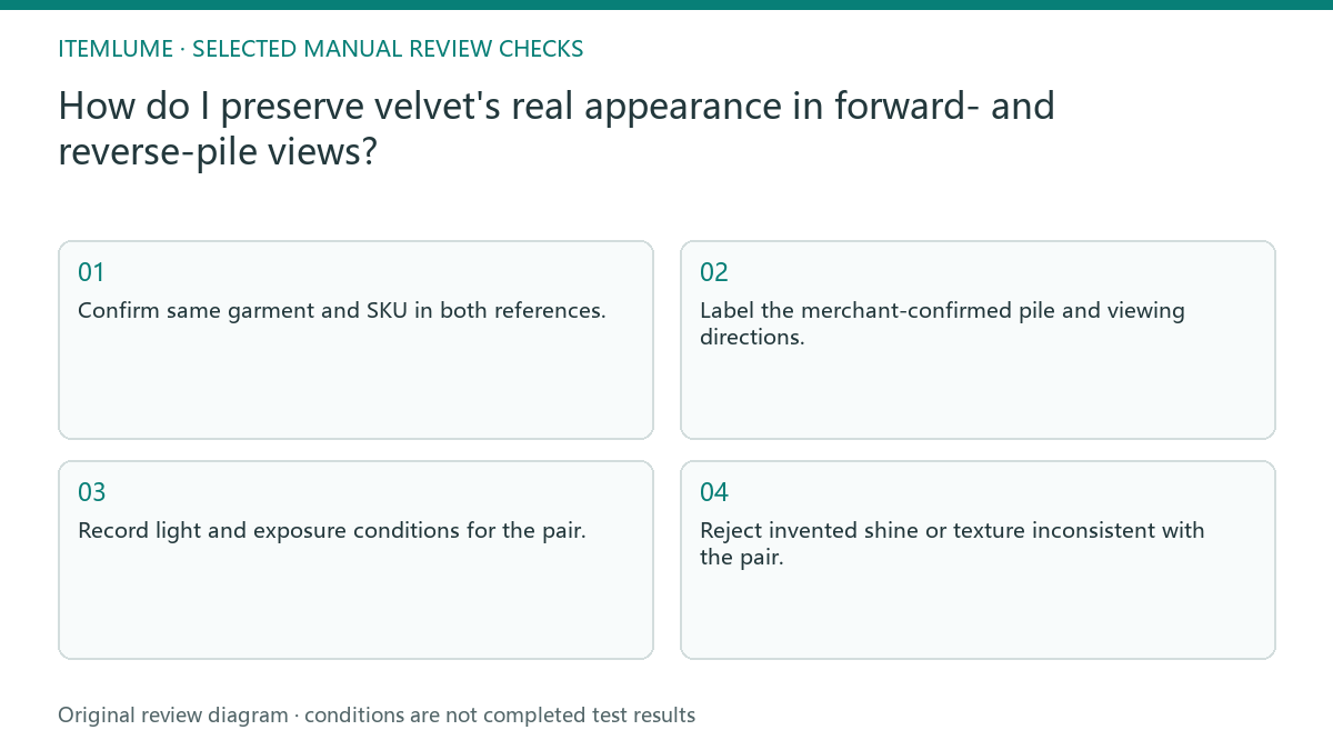
- Confirm same garment and SKU in both references.
- Label the merchant-confirmed pile and viewing directions.
- Record light and exposure conditions for the pair.
- Map the relevant panel onto the chosen model pose.
- Reject invented shine or texture inconsistent with the pair.
A fictional velvet-jacket comparison
Fictional exercise: a green velvet jacket looks darker in a front reference and lighter when the sleeve is viewed against the pile. The merchant confirms both photographs show one SKU. The review retains that pair instead of selecting the brightest photo as the only correct color. No material test was conducted here.
If the generated sleeve becomes metallic or the entire jacket changes hue, compare the panel and direction separately. Request a clearer source or a simpler pose when the relationship cannot be verified. Stop trying to force a single swatch onto all folds; the goal is a supported representation, not uniform brightness.
Approve the garment view rather than a texture adjective
Review panel orientation, seam locations, and the documented lightness range together. A convincing fabric texture can still be placed on the wrong panel or conceal a garment detail. Keep the approved pose and real reference pair with the final asset so future campaigns can follow the same evidence.
Itemlume model imagery is a visual creative workflow, not a material-quality or fit test. It does not measure pile direction, hand feel, or garment performance automatically. Stop approval when the merchant cannot confirm the sources belong to the same item; re-labelling a visually similar jacket does not resolve that evidence gap.
Directional-material reference record
| Observation | Reference check | Approval condition |
|---|---|---|
| Two brightness levels | Same SKU and controlled pair | Both appearances supported |
| Metallic generated shine | Real directional highlights | No invented surface treatment |
| Panel direction changes | Seams and panel map | Orientation remains plausible |
| Quality adjective requested | Supplier evidence beyond image | Unsupported promise omitted |
Use this matrix as a manual review record and add your own real evidence. Its conditions are not completed test results.
Sources and further reading
Sources for this page were checked on . Platform rules can change; verify the current source before publishing. Prompt examples and workflow recommendations are Itemlume editorial guidance, not independently measured results.
Frequently asked questions
Should every view match one color value?
Not automatically. Check real directional behavior and exposure before imposing a flat value.
Do highlights prove softness?
No. Visible light behavior does not establish tactile quality or material performance.
Can unrelated photos form the pair?
They are weak evidence. Use the same verified SKU and record comparable conditions.
BUILD FROM A PRODUCT YOU KNOW
Put this workflow into practice with your own product.
Explore the relevant tool first. AI copy and concept planning are free after sign-in. Image and video generation require available credits and the applicable account access.
Open Virtual try-on Check pricing and credits